Sundarbans is a forest in the western coastal region of Bangladesh in Bay of Bengal. It was declared UNESCO World Heritage Site in 1997. This project was done as a brand design exercise for Sundarbans and for the graphic design class at Northeastern University. The studio class was designed to touch on many aspects of graphic design including but not limited to illustration, typography, colour theory, commercial constraints etc.
The deliverables for this class are listed:
Brand identity: includes logo, logotype, colour palette, typefaces and fifth element
Business card: for the people working for Sundarbans
Business letter format: for formal communication, includes letterhead
Business letter envelope: for mailing formal letters
Information sheet: a pamphlet that serves as introduction to the Sundarbans
A set of 3 commercials: for the Newyorker magazine
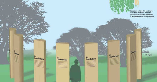
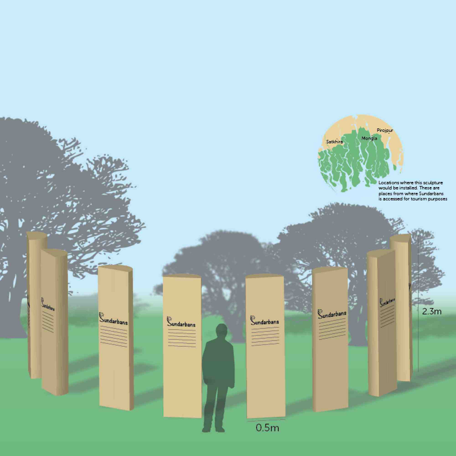
Site sign: A sculpture design with introduction to the place in multiple languages
Booklet: with details of the UNESCO World Heritage programme and the Sundarbans.
Logotype
Logotype was designed with extensive drawing of all the ideas that happened in my brain or collected from inspirations and helpful constructive critique by my classmates. Bengal tigers are the native species on the Sundarbans. Although there are other species of birds, fish and fresh water dolphins that live only in the Sundarbans, I picked Bengal tiger since it is also part of many traditions carried out in Sundarban tribes.
A curvacious but simple typeface was chosen to go along with the illustration of tiger in order to emphasise the illustration and include the organicity of forests in the logotype.
Colour palette
The base colour palette chosen for the brand was based on the features of the Sundarbans itself. The colours are not directly picked from the Sundarbans forest as it’s a extensive forest, the biggest mangrove forest in the world, but the colours are representations of the forest’s features.
Fifth element
The fifth element is an element in brand design that can be used to represent presence of a particular brand in the absence of a logo. It could be a pattern like Sephora’s white and black stripes. Sundarbans is a forest with great variety of flora and fauna. The fifth element tries to capture the essence of that. In fact a lot of my initial drawings for a logo were of birds found in Sundarbans, but because it’s hard to draw a particular species of sparrow distinctively I chose a tiger but a bird and a branch worked perfectly as a fifth element.
The designs for booklet, sculpture, information sheet are in this dropbox folder for you to explore. Thanks for reading about my project.


